Sleep Dream
Improved information architecture and visual accessibility for senior-friendly usability.
UXUI
Health Tech
Case Study
2024
Role
Sole Product Designer /
UX Consulting ( Project-based)
Timeline
2024.8 - 2024.9
(10 Weeks)
Responsibilities
UX Research
Redesign
Tools
Figma
Background
Application

Smart Pillow
Control box

Radar Sensor

Sleepdream is a smart sleep solution composed of a patented radar sensor, a smart pillow, and a mobile app.
Despite its advanced technology, many users struggled to understand how the system worked and what impact it had on their sleep. Ahead of the Version 2 release, the PeopleMulti team engaged me as a UX consultant to identify and address these gaps in user understanding.
Research
Research Methods
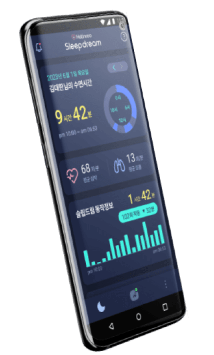
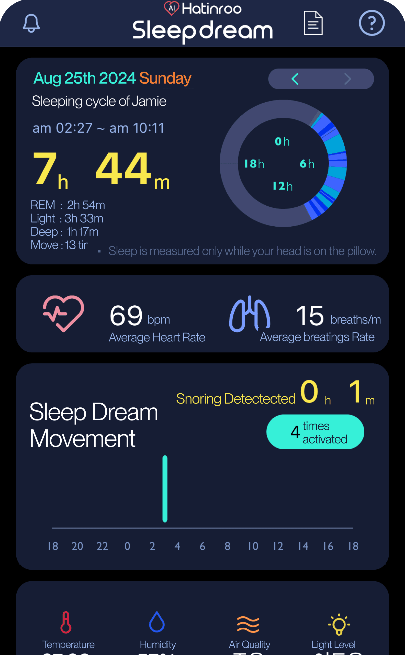
Current App Analysis
UX flow and feature usability review
Internal Stakeholder Interviews
Insights from marketing & CS teams
CS Inquiries
Patterns of frequent user issues
Current App Analysis
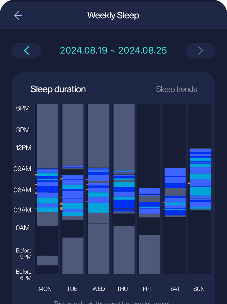
Key functions are buried in complex layouts,
preventing older users from understanding product benefitsInformation Overload
Too many metrics are displayed on
a single screen, making it difficult to
grasp the key insights.
Visual complexity
Small text, multiple colors, and numerous
icons used at once make the interface less
intuitive, particularly for older users.
Lack of meaning
the interface does not clearly show
practical value.Users are unsure whether the device is properly connected to the app,
leading to doubts about whether data is being collected or features are active.
Unclear Color Guide
Current color indicators are difficult for seniors
to notice and inaccessible to users with red–green
color vision deficiency.
Users couldn’t understand how the tracked data led to better sleep
due to a lack of in-app interpretation or guidance.
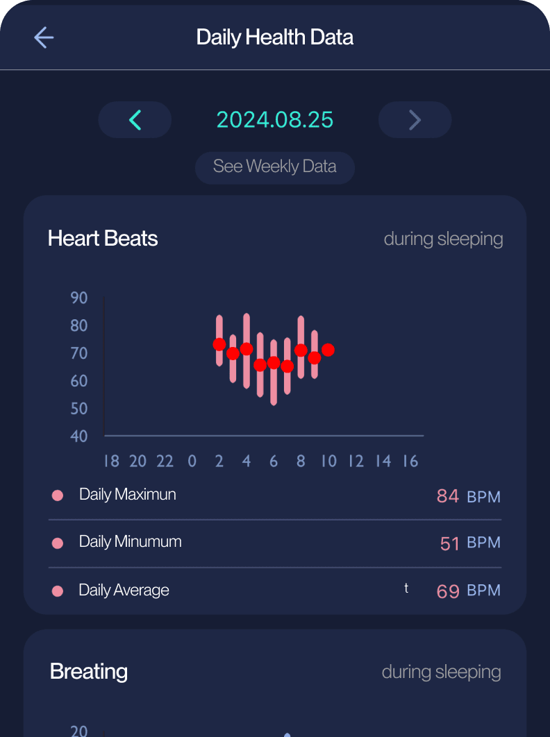
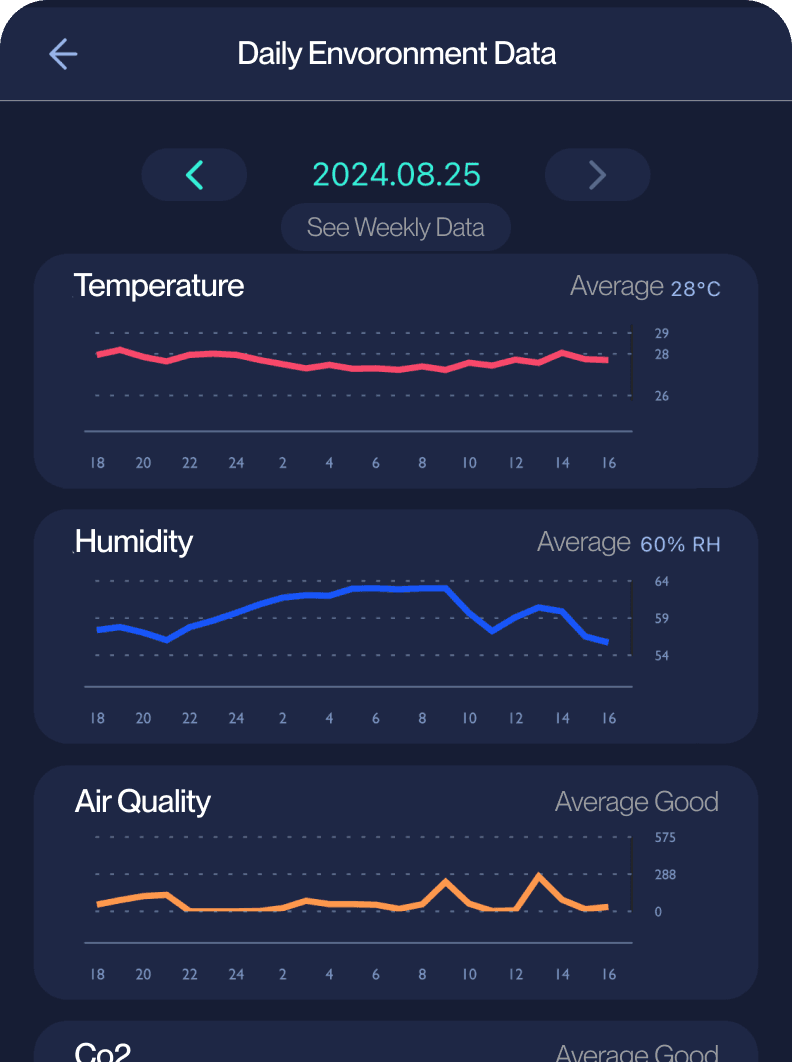
Charts present raw numbers, but users cannot see how these metrics relate to better sleep quality
Internal Stakeholder
Interviews
Users often call customer service due to insufficient information in the app,
including questions about where to find specific details.
The absence of in-app device status information makes it impossible to diagnose customer device
connection issues, as neither support staff nor the customers themselves can identify the source of the problem.
While the customer service team lacks visual information to guide step-by-step issue resolution,
leading to diminished trust in the device.
Disappointed customer reviews reveal a disconnect between the product's marketing as a sleep solution
and its actual effectiveness in reducing snoring, which was the primary expectation for many buyers.
CS Inquiries
Analysis
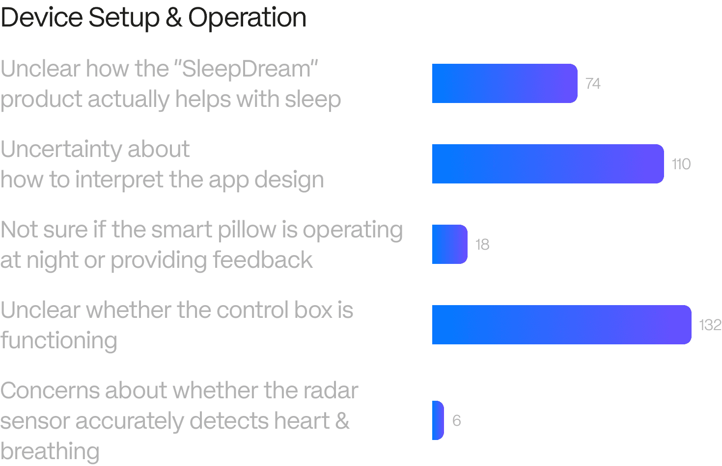
Device Setup & Operation
App Usability
Misaligned snoring expectations
Other
CS Inquiries Received in 2024 (Total 523 cases)
Development
Development Insights
Clarify device connection & guide troubleshooting
Turn raw data into clear insights
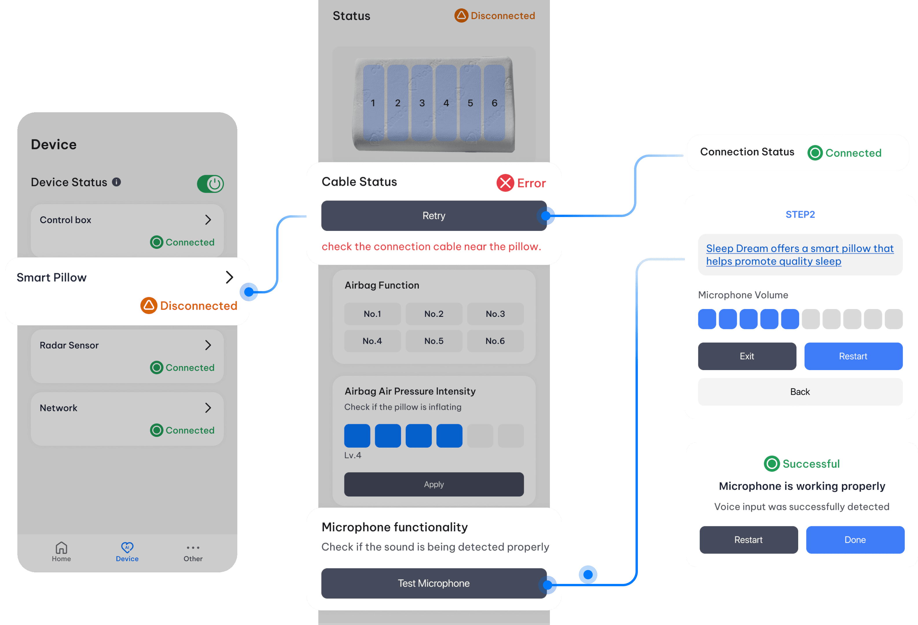
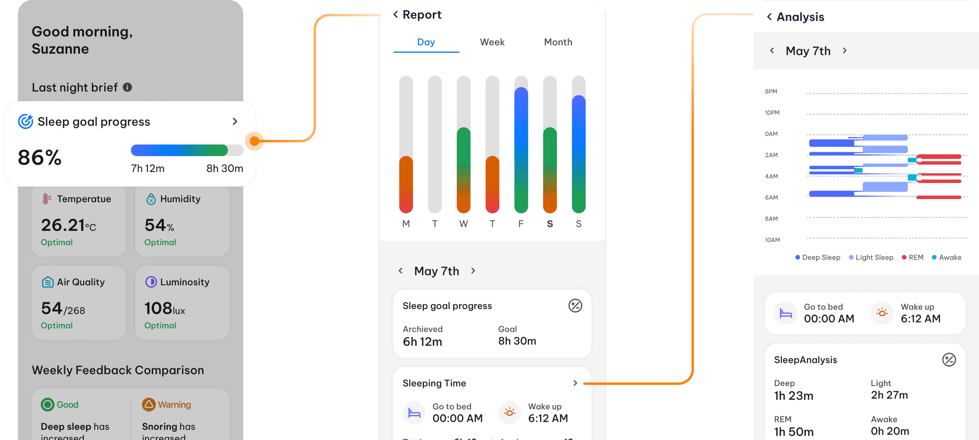
Development Iterations - Clarify device connection & guide troubleshooting
To resolve major connection uncertainties, I prioritized the
[Testing Device] feature, which scored high in user value despite higher complexity.
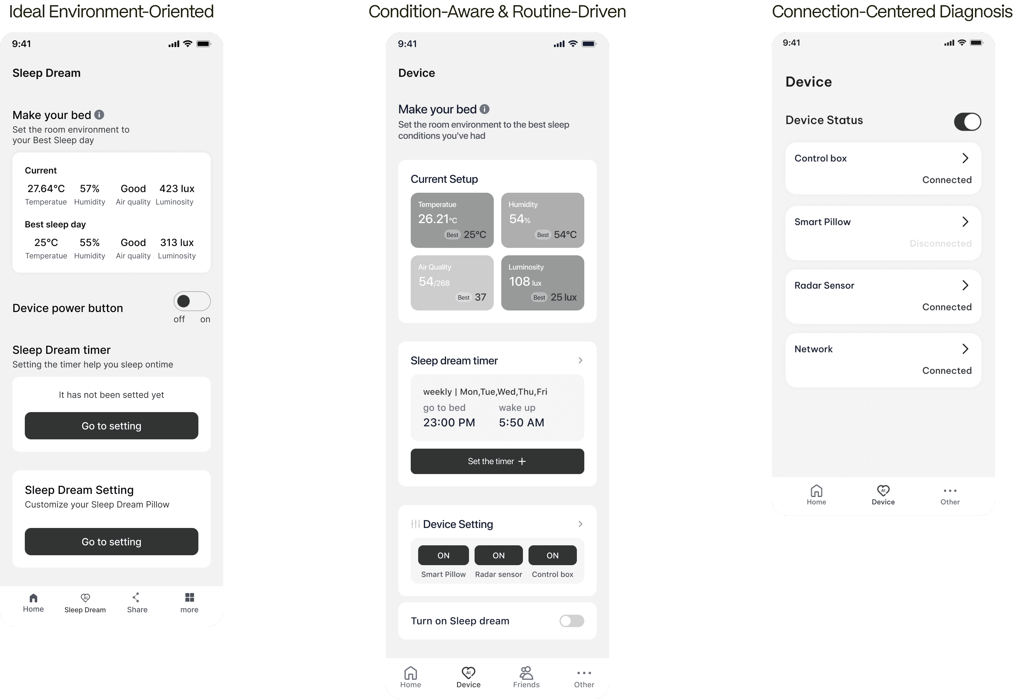
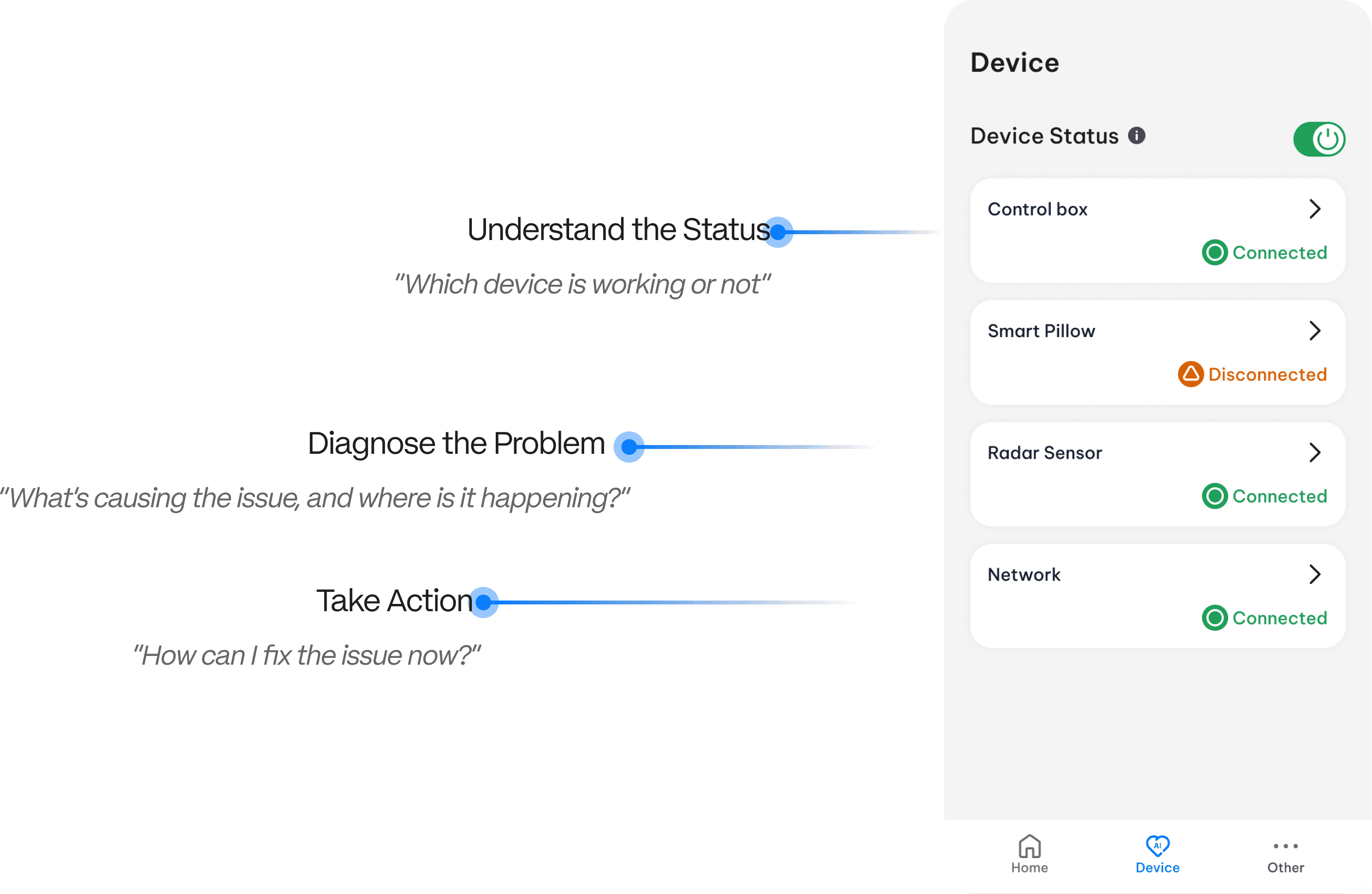
To help users resolve device issues more intuitively,
I explored three Testing Device iterations of the device control interface
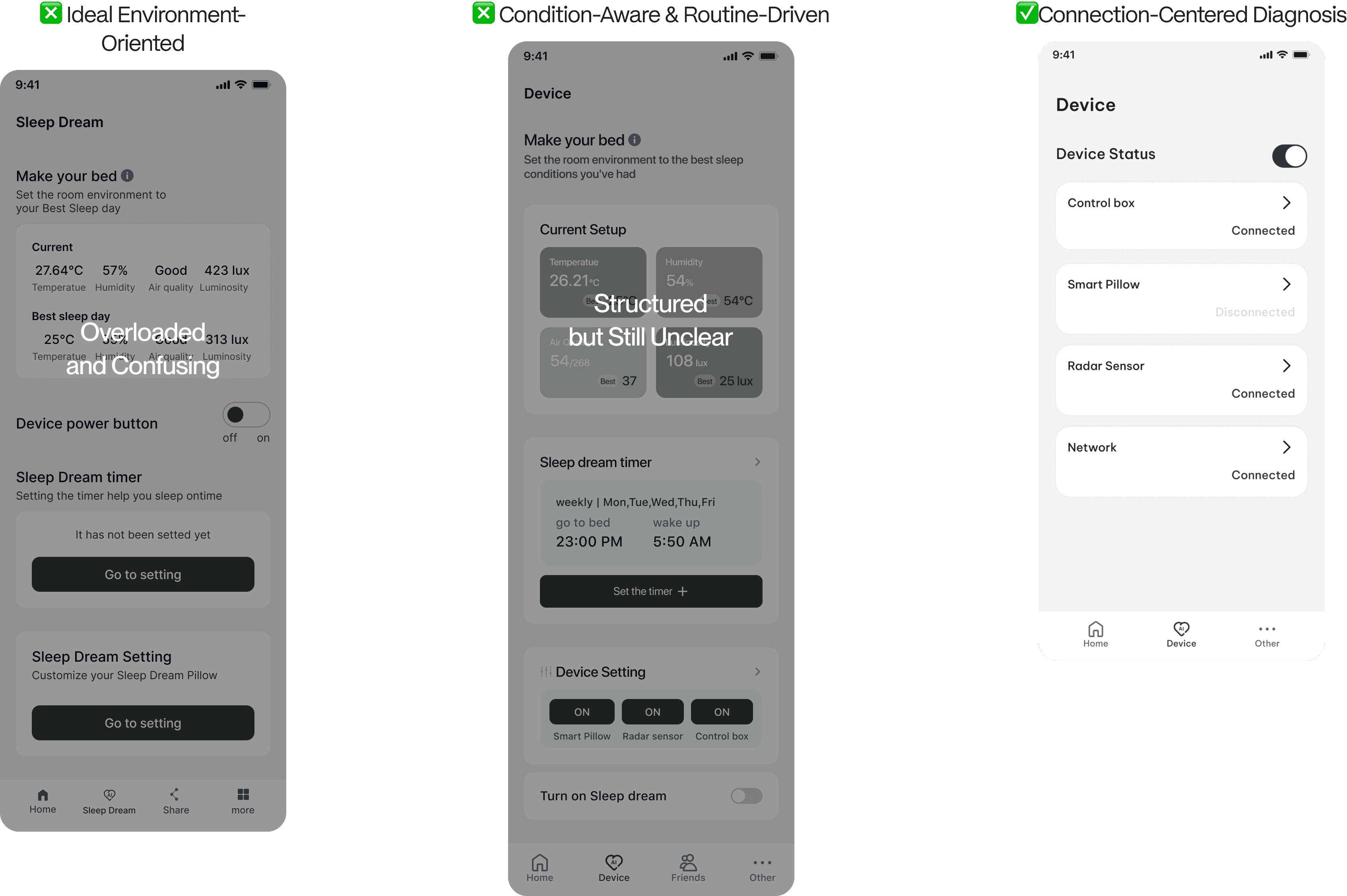
Empowering troubleshooting through focused status awareness and clarity
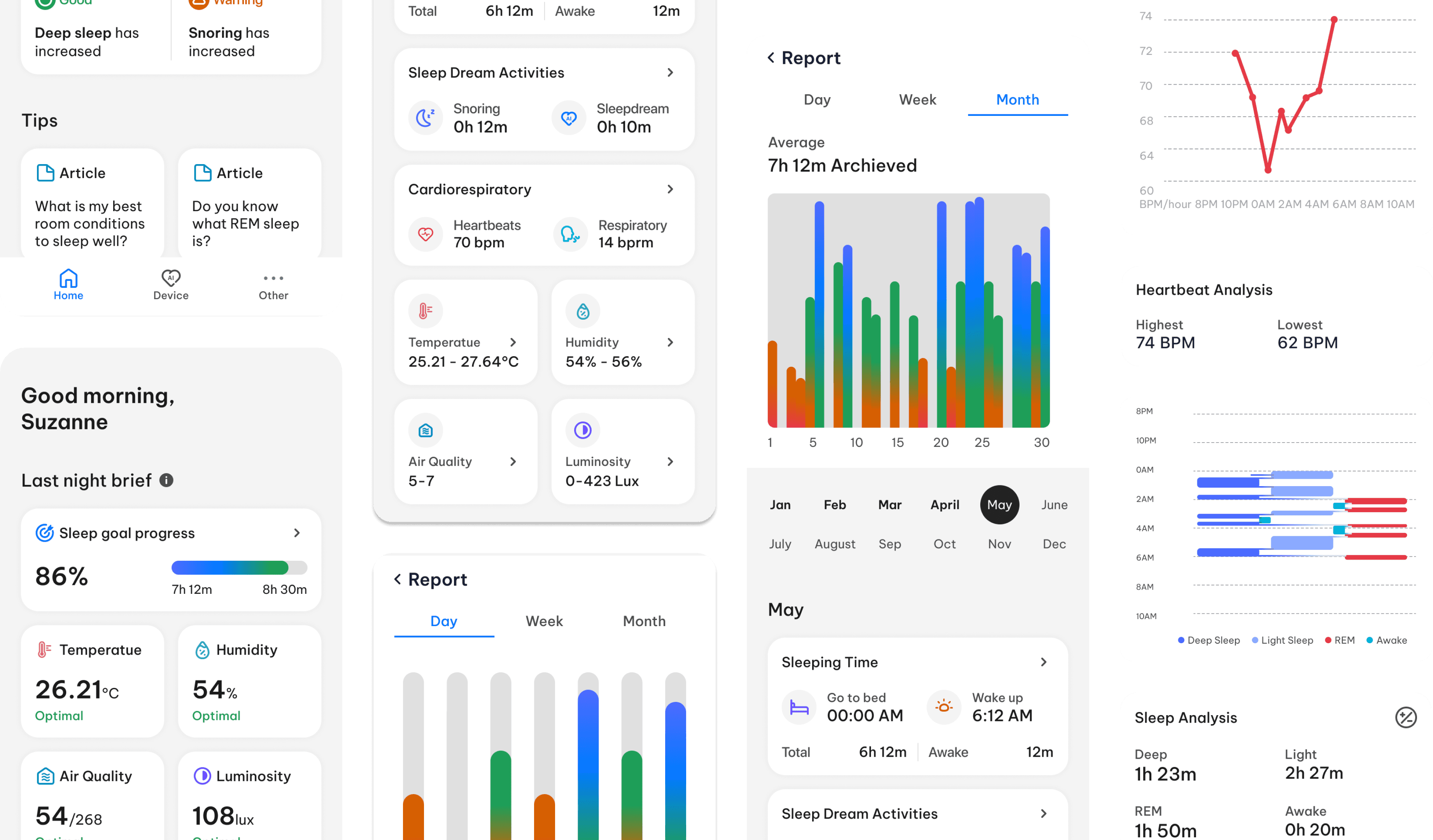
Development Iterations - Turn raw data into clear insights
To make the experience more accessible and supportive for older users,
the Sleep Feedback feature was iteratively refined through three key design directions
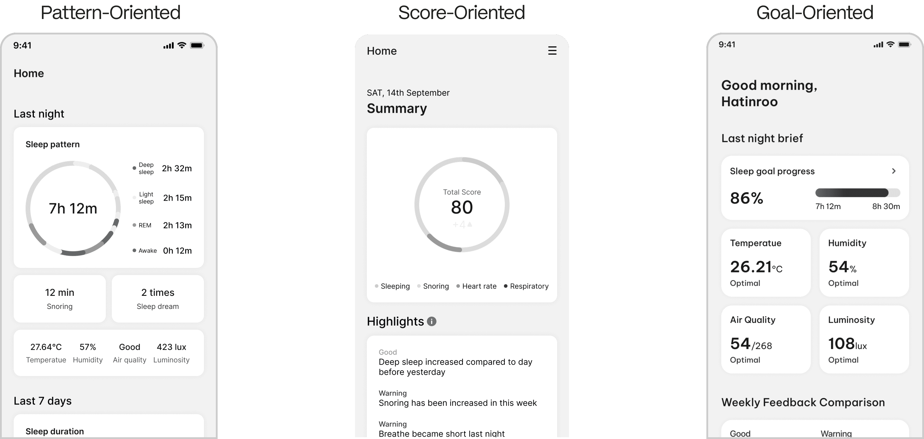
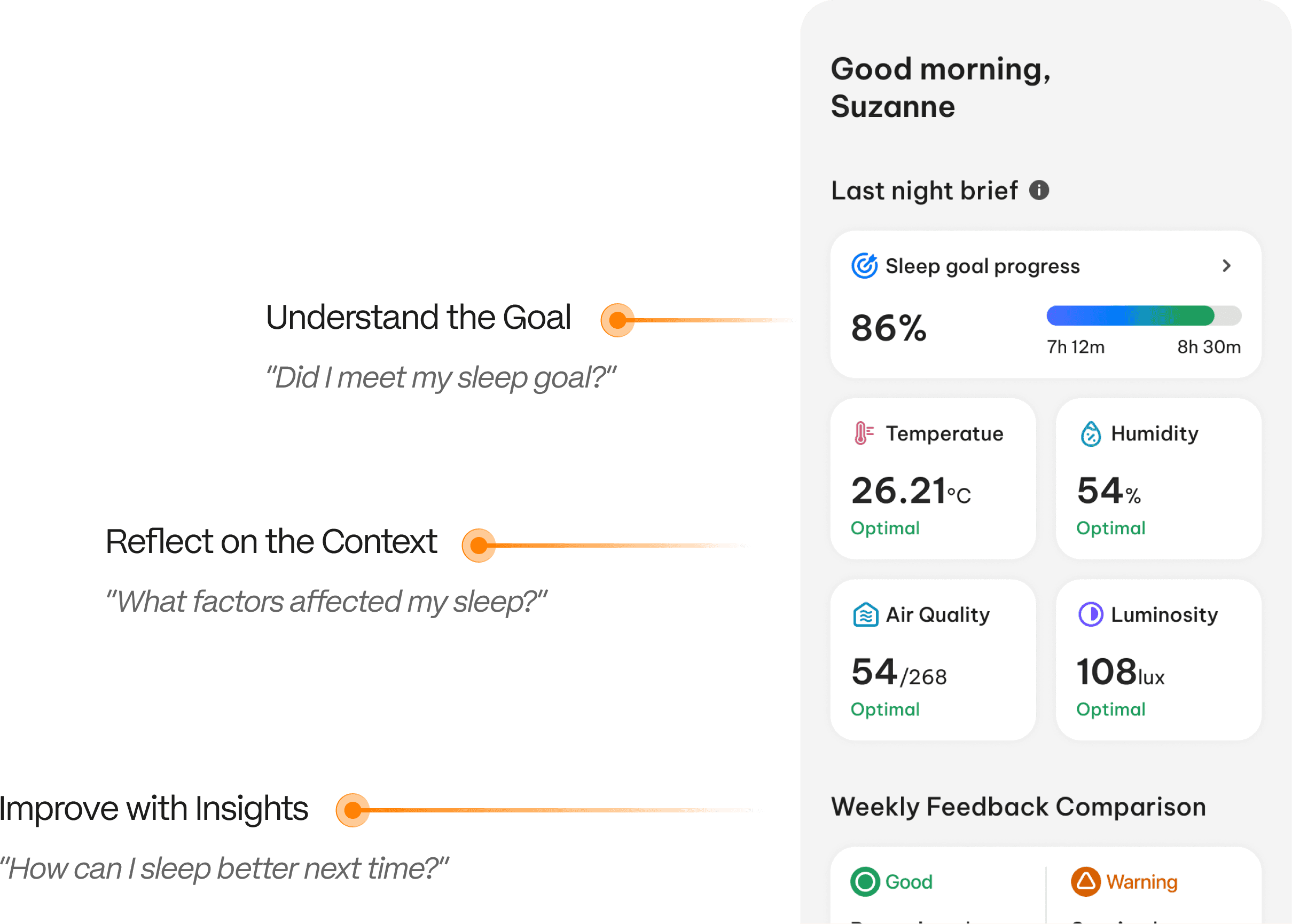
By narrowing the focus to a single key behavior,
the final iteration avoids overwhelming users in a clear, supportive format
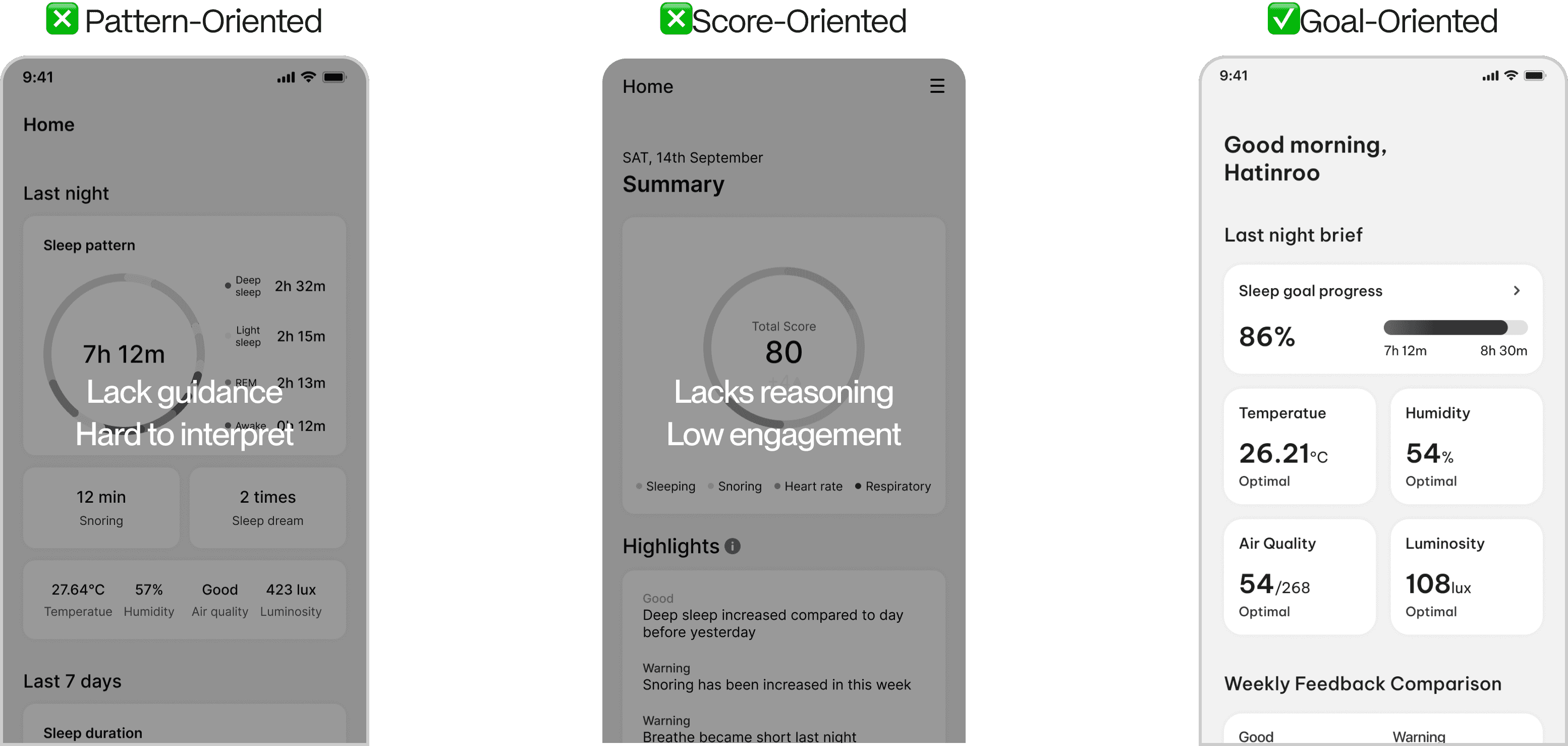
Empowering sleep improvement through clarity and context
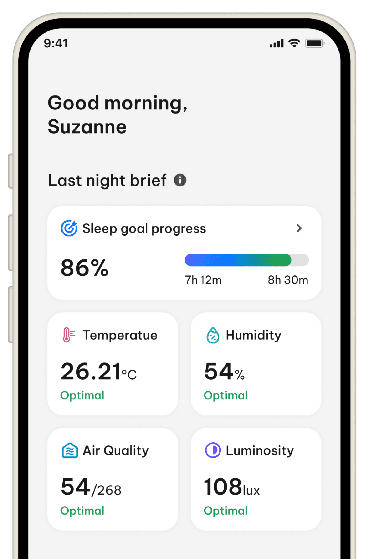
Final Design
Design Styles
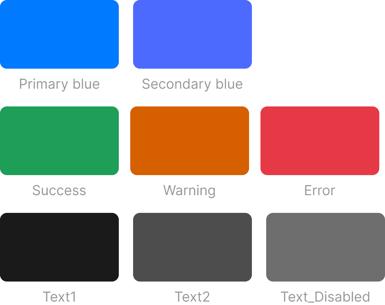
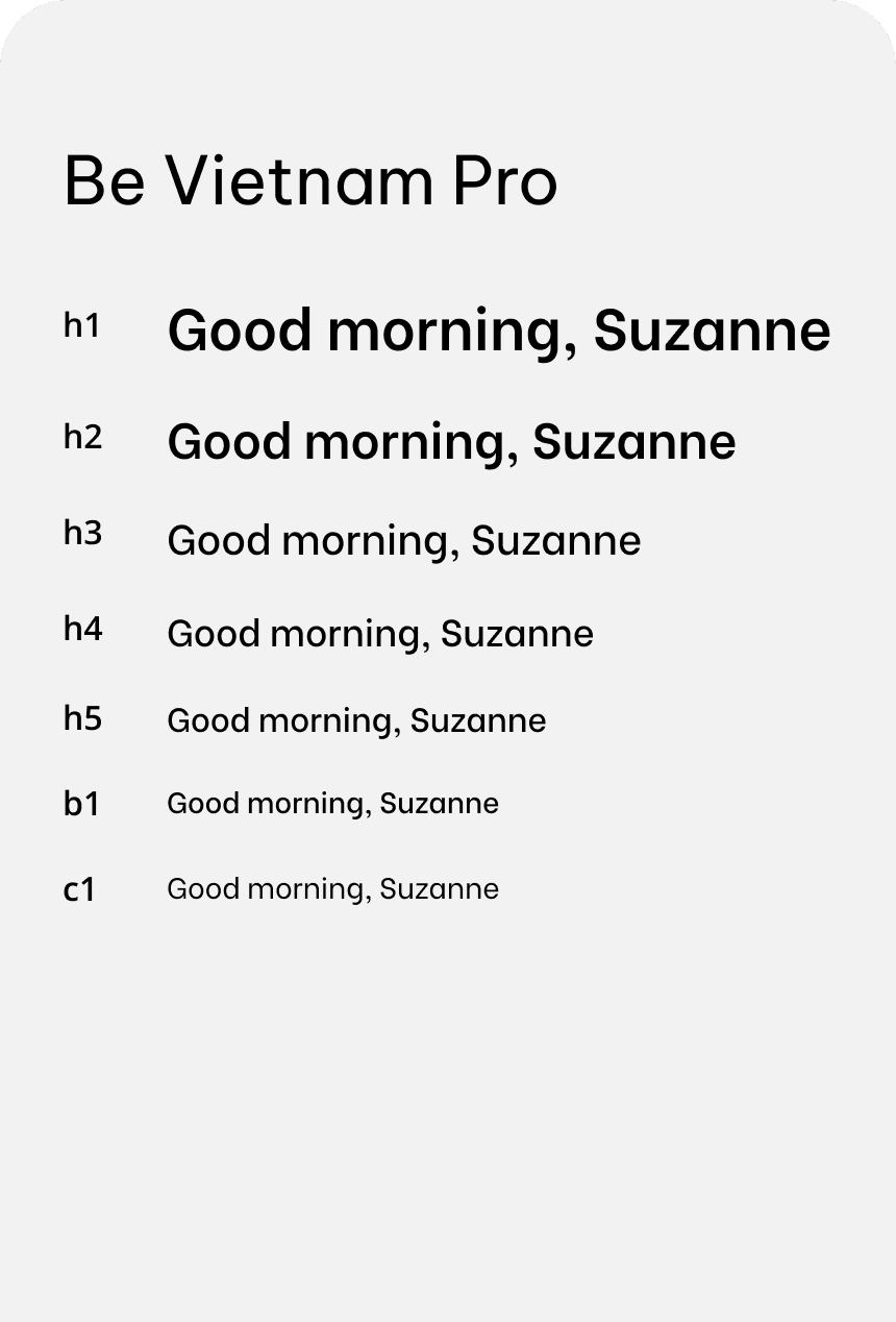
Applying WCAG AA standards
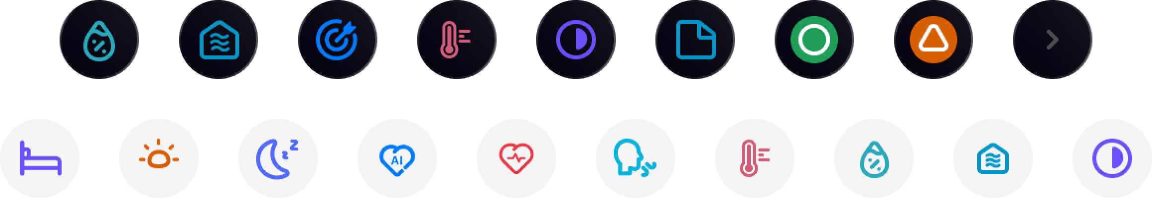
Icons
©Jamie Chung 2025